- Movie Poster Project: we were to make our own movie poster.
- This was for Digital Desing I.
- I didn't really have any inspiration. I used Photoshop to finish this project.
- The only problem I had was trying to figure out where to put all of the people.
- I think that the overall success is pretty well. There are some things that could be changed. Like trying to figure out what to put in the background.
Monday, December 13, 2010
Movie Poster
Friday, December 10, 2010
Drawing Poster
- Drawing Poster: we were supposed to make a poster for either figure drawing or drawing class.
- This was for Digital Design I. But the art teacher Mr. Wright is going to choose which one he likes to advertise drawing/figure drawing class.
- The main problem that I had was trying to get the pictures to go with the background. I used Photoshop to finish this project.
- I think that this project didn't turn out to bad. It probably could've used more work, but for the little time that it took to make it, it's not all that bad.
Cyborg
- Cyborg: we were supposed to turn ourselves into part robot part human.
- This was for Digital Design I.
- My inspiration was the movie Robots. I used pictures from the internet to put his together. I used Photoshop to finish this project.
- The main problem that I had was trying to find the right robot parts to use.
- I'm not very happy with this project. I didn't really care for it, and that went into making it. Therefore, the project is not all that great.
Wednesday, December 8, 2010
What's On Your Mind??
- Whats On Your Mind?? We were to think of something then put it in our head.
- This was for Digital Design I.
- My inspiration for doing the Spongebob theme was that i <3 Spongebob, so it wasn't to hard to figure out that I wanted to do the Spongebob gang. I found pictures and used them to put this project together. I used Photoshop to finish this project.
- The main problem that I had was trying to find the characters that has the entire body and not just the top part of the body.
- Over all, I think that this assignment went fairly well.
Thursday, October 21, 2010
Silhouette Project
- Silhouette Project
- I designed this for Digital Design I
- Starting this project was frusterating. First you had "cut" the picture from the background that it was taken on and pasteit to a new document. Then doing that with the other two pictures as well. After that, I positioned the pictures the way i wanted them and used the gradient tool to "color" them. I used Photoshop to make it. My inspiration to make this was Andy Warhol. And, this project is finished.
- The main problem I had was trying to get the background to change to the color I wanted, and finding the right color scheme.
- My assesssment would be that it could definetly use some fizzle, but idk what fizzle it needs. Therefore, I left it blank. (; It most definetly needs more work.
Friday, October 8, 2010
Warhol Prject
- Famous for 15 Minutes - Andy Warhol Project
- I made this picture for Digital Design 1
- The process for making this project wasn't to challenging. My inspriration was that my teacher put what color adjustment we were supposed to use on a worksheet. When he did that, I didn't have to figure out which one I wanted to use. I used Photoshop to make this project and it is finished. It only took a couple of days.
- I didn't really have any probelms with making this.
- My assessment would be that this project was fun and it made me look really differernt. I am happy with this assignment because it wasn't hard and it turned out really well.
Monday, September 13, 2010
Parody Sign
- This is a parody sign that I made. Originally it was just a FORKLIFT XING sign, then I put a runner on there so that it looked as if the forklift was chasing it.
- This was for Digital Design I.
- I used Photoshop to make this parody sign. It is finished and took a couple of days to complete.
- The main problem that I had was using the different layers to get everything done.
- I am happy with it, but I think that I could have definetly spent more time on it.
Friday, September 10, 2010
Text Portrait

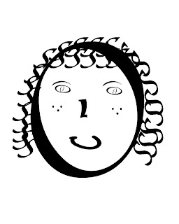
- I used Photoshop to create a text portrait of myself.
- I designed this for Digital Design I.
- I finished this project yesterday, and my inspiration was to try to make it look cartoony but then again real life.
- My biggest problem was trying to find something on the keyboard to represent a mouth.
- I think that this picture has me looking like a little kid.
Subscribe to:
Comments (Atom)


